 Front
FrontParental advisory logo bottom right of the cover.
Black title and band name at the top, contrasting the white background, very visible and easy to read.
Band are shadowed against a white backdrop, seemingly staring into the ocean, this is a typical album cover shot. A long shot is used and the image is clear, this could be used for our digipak.
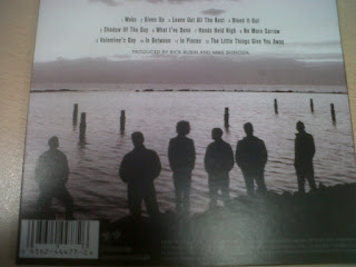
 Back
BackReverse shot of the band facing the ocean, more shade/black is used in the background to make them almost shadow - like, this is a simple yet effective method of drawing attention.
Track titles can be seen, in black and white.
DVD credits at the bottom in white colour, on black background, which is provided by the back cover image.
Inner Panel
White logo, Band's logo most likely, in the middle.
Dark images of band performing are merged together, to form a background for the logo, behind the scene pictures are used such as location shots, this again could be replicated in our digipak.
Middle Panel
 |
| Middle Panels |
No comments:
Post a Comment
All Comments Moderated