Thursday 26 April 2012

Digipak and Mag Ad Feedback

For the digipak and magazine ad, we got told that:


  • We needed to add 'Presents' to the magazine ad, in order to make it clear which text was the band's title
  • Add the digipak cover to the magazine ad

  • Add an 'includes' sticker to the digipak front cover
  • Add more small print to the digipak cover and to look at conventions of other band's digipaks
  • Include music videos to the track listings and track timings to the booklet
  • add indie record labels to the digipak to give the impression this was a signed band

Casting

Our cast members were chosen to fit the age range of our target audience, therefore we selected from our age range, to relate to this audience. We then from people who could meet our tight schedule of filming, to which we decided to include myself in the narrative side of the video, due to me always being there when we needed to film. This saved a lot of time and effort in casting as we were also confident I could do a good job in my acting role.
We picked the girl by deciding who could portray a good match for the male character on screen, and we decided that Katie, who we eventually cast, was a good enough actor to give that impression to the audience.

Location

For our music video, we have decided to shoot the performance footage in the George's basement. This is because lots of indie music videos use a distinct setting, and we believe the idea of filming in a basement gives the impression that the band are just regular and are trying to make it in the industry, like many other bands out there. This in itself is quite a distinct and indie thing to do.

For the narrative scenes, we used George's house as it gave the impression that this couple were happy together and had a stable home, whilst using other locations such as the park and the river to show how, especially at the river, distinct settings can produce wild reactions, such as the slap at the river. The outdoor settings were used to diversify the couples' activities and interests, showing the audience that this couple could do anything together and had something special.

Monday 16 April 2012

Digipak And Mag Ad Completion

Our digipak and magazine ads have been finalised and this means that they will be up on the blog shortly, subject to feedback.

Magazine Ad Deconstruction 4 Artic Monkeys - Inspiration

Our magazine ad is very similar to this in it's formatting, and seeing as we took heavy influence from Artic Monkeys in our product decisions, it is worth paying dividends to it. The advertisement has a key image to the left, which is a key part of our magazine ad, with the important info all down the right hand side, again similar to ours. A black and white background has been used, and although our audience attracting image is in colour unlike this one, the background is the same.

Artic Monkeys are both extremely successful and popular in the alternative rock genre so we took special influence from their work as it has proven to be a success, we feel with their formatting an audience could relate the two advertisements and therefore give us stronger genre links in the wider perspective.

GG - Filming complete

We are now confident that we have finished all the filming we need for our music video. We have had to do endless re-shoots and numerous rough cut edits but, this has only helped us make sure we produce the best video we can.

We have taken into account all the audience feedback we received from our class mates and friends. The main changes we have made are; instead of 3 scenarios there are now 5, we will use less of the performance footage and we have improved our framing of shots. 

We have imported all of our shots into Final Cut and now plan to start our final edit. 

GG - Digipak and Mag ad photo's

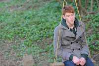
We have managed to get the photo's for our digipak and magazine ad done. Our idea was to find a swing on its own and in a run down area. After weeks of searching we found one that fit the bill and manage to take some photos.
The plan for our digipak is to have a shot of a person of the swing from the front (front panel) and the same shot from behind (back panel) 


For our magazine ad we plan to use the image to the left whilst adding text and other small images of the digipak. 

All photos were taken by John Gamble: http://www.flickr.com/photos/johngamblesnaps/

GG - One Shot Performance vid

Here is a video of Jigsaw by The Swing Movement, edited on Final Cut and filmed on a Nikon D300s by George. It all all one shot with audio put in during the editing.

GG - Change in narrative

After receiving our audience feedback we have decided to add two more scenario's to our music video. This will bring the overall to five, plus performance. The idea is to have 3 of the 5 scenario's to end in an argument, and 2 to end well. We are going to keep the original three, but film two more.

Our idea is to have the couple walking beside a river hand in hand, they will also feed the ducks etc.. This will be happy memory. Our second new idea is for them both to be having a meal together, for the females birthday. This will build up to an argument after the female glances at the males phone as he is texting someone.

Instead of having all the memory's coming from the photos, we have decided to use objects in the room to create the memory. For example, a birthday card which leads to the memory of the birthday meal. The card will be in a bin, then we will cross cut to the memory.

TW - Magazine Ad Deconstruction 3 Kyle Park - Inspiration

This magazine advert, for Kyle Park's Make Or Break Me, has no direct link to our final product or target genre. However, what struck me when I came across it, which was completely by chance in a media lesson, is the Wild font, along with the more rigid one that is used on the album title. I believe this has been some inspiration for our work as in our final product we have gone for very similar font choices. This is because although Kyle Park is not in our genre, the fonts do appeal to an indie audience as they are quite wild and vivid, and look classy without having too much actual elegance about them.