 Front
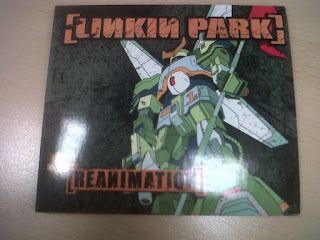
FrontAnime style artwork was used, with what looked like a transformer on the front.
Murky green background was used, with sort of a splatter theme used - some images such as letters can be seen.
Band name and album title are in bright orange, and can easily be seen, they appear to be scratched, although this is part of the artwork.
The backgrounds of the titles are reversed - Linkin Park is in orange with a black around it, whilst Reanimation is black with orange round it.
Back
 |
| Back Panel |
White and orange colours are used to display song titles, which are on the left of the back panel, more anime style artwork can be seen right by the track list.
Green splatter theme is continued.
Inner Panel
Green and red colours dominate this, splatter theme is again seen, white drawing is in the middle, possibly the band logo for this album.
Track listing is once again displayed.
Band name and album title is again displayed, this time in white and red.
Middle Panels
More shots of the anime, transformer is seen on every panel, in a different pose, with colour unlike the drawing on the Inner panel.
Splatter theme and green background is again used.
Images are either drawn (anime - style) or CGI as they are of high quality.


No comments:
Post a Comment
All Comments Moderated