 |
| Front Cover |
Front
- A grey background was used, with a globe type image, with the earth in the centre, situated on the front, this covered most of the cover. There were lots of vivid colours to catch the eye.
- 'Includes...' sticker was used in order to add purchase incentive for fans.
- Band and Album title could be seen easily.
Back

- Barcode and production logos can be seen.
- Picture of band walking, in black and white, in a long shot with a blurred effect used on the image.

Inner Panel
- 4 of the same shot, with lighting effects used to vary the colour (lighter - darker).
- Divided by black outline, matching the black background.
Middle
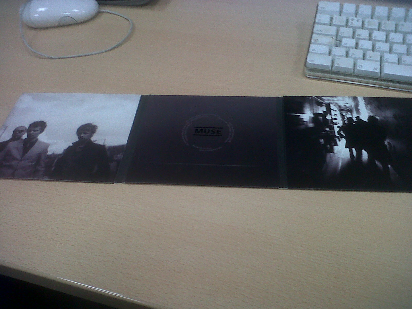
- DVD credits in the middle of the panel, with the band's logo.
- More shots of the band, blurred effect used again.
- Mid shot used on the left panel, Long shot used on the right panel, this is noticeably varied, could be a way to give the buyer new experience with each panel.
- The backgrounds of the panels are contrasting.
No comments:
Post a Comment
All Comments Moderated