Monday 30 January 2012

TW - Storyboard

This is our storyboard for our video, which is what we aim to replicate in terms of how shots are ordered. The narrative has since changed but this was the plan for the original idea. It will be composed into an animatic tomorrow.


TW - New Narrative Plan

As we have received critical feedback to our narrative aspect, I have now devised a new story-line that sees the plot enhanced. We now plan to use 4 small scenes, not 2 which means obviously there is now more of a story to tell.

The 1st sequence is the couple on a walk, enjoying each others company, there can be fade-type cutting used of them walking to being sat on a bench, showing time has elapsed yet still filming in exactly the same frame. The couple can also be feeding ducks as this is common around ilkley river, which is a location we are likely to use.

The second sequence will be the couple sat on the sofa, watching TV, in a sped up shot of them just sat there together in each other's company. The sped up shot allows us to show how much time has gone by with them just sat together. This shot will be cross cut with a transparent view of the couple arguing, and the camera circling them with fast paced shots. This shows that not everything is ok in the relationship and provides some narrative in the sense the audience has doubts about if the relationship will work out.

In the 3rd scenario we see them both moping around, unhappily and the possible use of drinking to connote depression, along with the gloomy setting. The male lead will try to call the girl in an attempt to sort things out after their fight, but she will read the caller ID and decide to not answer and simply let it ring.

All of the scenarios will begin with the original idea of the male lead looking at the particular scenario in a photo album, with the picture leading into the scene. The 4th scene begins like this, in which it gives us another happy time with the couple, possibly in a different colour scheme as the other scenarios to show that it was further back in the past, before the fight.
The shot will then fade back out into the view of him looking at the photo, and he will then put it in his pocket, and slam the photo album shut, possibly even dropping it to the floor with some of the photos dropping out. He then runs outside, and the narrative will end with the same shot we used in the rough cut, where the male runs up to the girl he was searching for, and it is narrative enigma whether they reconcile or not.

Some feedback to this idea was given by my media teacher, in which he suggested possibly including someone taking a photo of the couple, which could be used extremely well in the 4th scenario, as in a reverse of what happens previously, when the couple has had their photo taken, it reverts to him looking at that picture, which is a different spin on what we were going to do.
He also suggested maybe stamping on some of the images in the photo album, to highlight the male's anger to the situation.

Friday 27 January 2012

GG- The Swing Movement (A brief history

The band formed in 2004 from the Yorkshire town 'Ilkley'. They are a four piece indie/alternative band with their own distinctive sound of powerful drum beats and strong bass lines. The four members: Ben Walker (Guitar and Vocals), Patrick Wanzala-Ryan (Guitar) , Joe Gamble (Bass) and Kieran Borrett (Drums).
In there short time of being together the band have managed to play at Leeds Festival, The Cockpit, The Love Apple and many more big venues and festivals, including preforming at a festival in Belgium. They have been signed to Long Island studios in London, who work with such bands as Wild Beasts. Here they created there first album 'Bottom of The Barrel' which they plan to re-record due to the creation of new songs. 'To The Bone' is one of their songs which has been released on itunes and had 100's of purchases in the first week. You can also find them on Spotify. There song 'Jigsaw', which we have selected to use, has been played on Radio1 with one guest saying "this is the best song we have received all week".

They are an up and coming young band who have suffered from the economical fall in the music industry. They are just waiting for the right recorded label to come along and hoping to kick start what should be a very successful career for them all.

Thursday 26 January 2012

TW - Rough Cut Feedback And Analysis

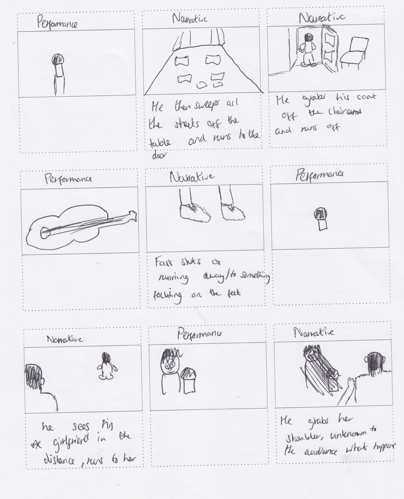
After screening our first rough cut that uses BOTH performance and narrative footage, we received feedback that in short told us we needed to completely re-think the narrative shots, and try to change the performance footage.

We are however unable to tweak the performance footage, only change shots due to what footage we shot, but have not used.

Therefore, we are going to try and intertwine focus shots (focus out at the end of one shot, to the go back into focus and it is the next shot). This can be used when switching shots of the performer's, or even when changing from a performance shot to a narrative shot, if we shoot the narrative footage in accordance with focus levels.

Another problem is that there was too much movement and rotation in our performance footage, which needs to be both edited out and rectified, this can be changed by trimming some clips down, or even just replacing them. Also, the rough cut we showed had less narrative in than we planned so there was more performance footage that we intend to remove. Hopefully when we re-shoot the narrative footage, we will have more to put into the final cut and this will strengthen the video.

The narrative shots were not very well received as it was said that it was quite weak, with several major issues, so we plan a major overhaul in that area.

TW - Magazine Ad Analysis 1 - Artic Monkeys - Humbug Ad

I have chosen to analyze this advert as it is by The Artic Monkeys, which is one of the bands that George and I have taken influence from, with George even analyzing one of their digipak's for our research.

The band is very much alternative rock, with a hint of indie and other genres. It would be fair to say that rock is the wider aspect of their music, but when narrowed down it does fall into the alternative category. This particular advertisement has been featured across Europe for their album Humbug, and was created by DebutArt.

As you can see, the advert is quite bold and vivid in it's colour scene, although it does have a washed type feature to it which causes it to lose some of the vibrance and make the colours seem less eccentric.
The background is orange, and is fading from top to bottom. This is met by the colours of the words used on the ad, as 'Humbug', is most clear in colour, whilst '24 August 2009' is faded and is closer matched to the colour of the background, due to the fade effect.
The middle of the ad shows a band logo, possibly used exclusively for this album, and has the band name stenciled into the middle. The logo appears to be 2 faces, back to back, joined by what could be their hair, or a representation of collaborative minds in relation to creating the album.

The fact that the band name is used in a stencil effect, attracts attention to both the logo and the band name immediately, causing the reader to read the rest of the info, which is only small pieces of information, likely to remain in the audience's mind so they remember the advert and the info easily.

Whilst this magazine ad is fairly simple, it does the job and could be modeled or replicated if we chose to complete 2 magazine ads, this being used as influence on the more simple of the 2 ads we would create.

Tuesday 24 January 2012

TW - The Swing Movement - A Brief History

The band, formed in 2004, began with around 20 members all jamming and having a good time. From the 20, 4 of the members, Ben Walker (guitar and vocals), Patrick Wanzala-Ryan(guitar), Joe Gamble (bass) and Kieran Borrett (drums) moved on and formed The Swing Movement.

They have progressed since then and performed at many local venues, with one song, To The Bone available to download on itunes, not to mention featuring on many renowned music applications such as spotify and last.fm.

They also have twitter, a fan page on facebook and an official myspace page to work with, and whilst they are still young, they have a lot of potential to be the newest big hit in the alternative/indie scene.

http://www.indiebandsblog.com/european-bands/uk-bands/the-swing-movement - This blog has some extra info on The Swing Movement including release dates amongst other pieces.

GG - Music Video has been a success!


Since I shot and edited our first sample scene for our performance footage it has been a big hit. Previous managers and record labels have seen the video and been in contact with the band. This shows the power of youtube, also after receiving over 250 views in a week. The video has also been used to enter the band into a competition to win a chance to support for Graham Coxon on his British tour this April. The video was placed onto his website and you can now vote to give 'The Swing Movement' a chance to perform in Gateshead. It can be seen and done on the following website:
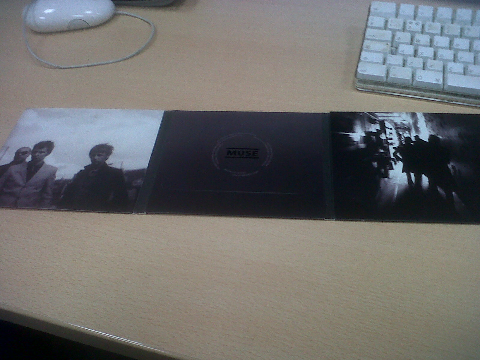
http://toursupport.grahamcoxon.co.uk/share/entry/270

This video is only sample performance footage and we plan to add a love affair narrative to the performance. When all of this is shot we shall give the video to 'The Swing Movement' to help them keep on progressing in the music industry.

The video has been placed below:

Wednesday 18 January 2012

TW - Digipak/Magazine Ad Jigsaw Idea

After thinking of ideas to incorporate into our digipak, George and I found that incorporating a jigsaw puzzle would be a good idea to use on one of digipak panels. This is because the song title is 'Jigsaw' thus gives us clear opportunity to utilise a marketing aspect, which would be using either jigsaw pieces, or some aspect of a puzzle in our ads and digipaks.

Image 1 - This is the template we found online
To get to the idea, we began with a blank template that we found online.

Once we had downloaded the template, we then proceeded to trace round it in order to layer the image. We did this in adobe flash.

Once we had traced the image, we saved it to look like it did in image 3.

After importing the traced version into photoshop, we then proceeded to layer each jigsaw piece, and then devised a DRAFT colour scheme. As seen, it was red/burgundy, black and white, which are basic colours, that are not too eccentric.


Image 2 - Tracing over the template 
Image 3 - Final trace

Using the red, black and white, we coloured in each jigsaw piece to show what he hope the final image might look like, before we edit it into a grainy effect to add an element of the jigsaw piece having been used previously, despite still fitting together.

As can be seen in Image 4, this is draft image, and not only does the editing need to be finalised, but we also need to add 'The Swing Movement' in, possibly a band picture, and also other aspects such as track listings, or an eye catching line, in order to maximise audience interest.
 
Finalised Image - Image 4

GG - Digipak idea 1

Tuesday 10 January 2012

TW - Plans For Digipak Based On Deconstructions

An Example Of Andy Warhol's work

  • The Linkin Park digipak for Minutes To Midnight has shots that would be perfect to replicate on our digipak, and these type of pictures are seen commonly on other successful digipaks and CDs as well.
  • Rammstein's use of the same close up shot of each band member in white could be well received, although an Andy Warhol type shot could also work in this instance.
  • Using that style also means we could use a shot of all the band and add this effect, not just one band member for each panel.
  • Going back to the Linkin Park digipak, the use of black and white appeals to us greatly.
  • We are likely to avoid the artwork used on the Reanimation digipak as it would be extremely hard to replicate work anywhere near this level of quality.
  • The cropping and trimming of shots used on the Green Day digipak also appeals to us, and we may opt for this technique for one panel, or replicate the inner panel of Linkin Park's Minutes To Midnight digipak which has lots of images almost collaged together from behind the scenes and locations.
  • The Reanimation usage of different colours for the words (both band and album title), and then add a small background around them, and reversing the colours, is appealing.
  • MUSE's use of a border in between 4 similar images on the inner panel of The Resistance, and then tweaking the effects such as lighting in each one, is also good, and we could fuse this with an Andy Warhol type piece of work of behind the scenes shots, which could work.
  • One problem with the Andy Warhol work is that the colour scheme is slightly eccentric therefore we may have to use simple colours such as black white and red, to make it effective, as none of the digipaks I have studied use colours such as pink and bright green.

TW - Common Conventions Seen In Digipak Deconstructions

After deconstructing 6 digipaks in the rock genre, I have now seen some trends and similarities form after observing each panel of each digipak. They are as follows;

  • Title and band name are situated, usually at the top, of the front cover, in a colour that oppositions the background, in order to bring attention to this.
  • Either a picture of the band, or artwork is used on the front cover. Artwork is usually used in the foreground of eccentric background, with effects such as splattering other colours into it.
  • The back cover includes song titles and logos such as the DVD one, and parental advisory notifications, that can also be seen on the front sometimes.
  • The back also maintains the same backdrop as the front cover, and can include images, or remain plain, only including track lists.
  • The artwork is continued in the inner panels, and the images are similar across them, not much changes as sometimes the band opt to use a shot, and use it across all 3 panels in the middle.
  • The inner panel can either have song listings and the band logo, or maintain the artwork displayed on the front and back.
  • All digipaks meet a theme, whether it be animation, or a background colour, or even a continuous use of a similar shot, and this works well, this one in particular we will try to adhere to

TW - Digipak Analysis 6 - Rammstein - Made In Germany - Genre Rock

Although Rammstein fall into the Rock genre, and are considerably a heavier band that The Swing Movement, their digipak for this particular album can be used as it could be applied to any genre, it is simple yet effective, and differs from many takes in which shots of the whole band are used as a shot for simply one panel.

Front
Title is at the top of the cover, in gold.
White background, with a band member painted fully white from head to neck, there are no parts of him that are not colored, he is in close up.

Back
The back uses the same clear white background, the back of the band member's head can be seen. Song title are situated where his hear should be, on the back of his head.
A gold barcode and credits are at the base of the neck.
Ears are red, possibly where the band member has had piercings previously.

Inner Panel
White background.
Other band member in close up, same shot as before with the member being pained fully white.

Middle Panel
Total of 6 panels, which is double the amount of panels in a usual digipak, suggesting this could be a special edition.
All the panels are the same, either having a band member in close up shot from the front or the back.
All of their necks have crosses on them, as well as stars and dates, possibly birth dates.
The use of white on a white background is effective and offers a different take on the usually heavy coloured backgrounds seen in other digipaks.

TW - Digipak Analysis 5 - Green Day - Bullet In A Bible

Green Day are another band that fall into the rock category and although The Swing Movement are an alternative/ indie rock band, this Green Day digipak has elements that could easily be common or replicated in a digipak for the alternative/indie genre.

Front
Parental advisory at the bottom right of the cover, DVD logo bottom left.
Red Background, with the Green Day band logo shaded into it.
Band member is stood in the middle, posing in a typical rock star-esque manner.
This image is black and white, and fans can be seen at the bottom of the cover, evidently as the audience to this band member posing.
These two aspects indicate that an image has been take and both trimmed and cropped, as this is in black and white, whilst the background is a rich red colour.
Band name and album title, are above him, in clear white.
The album title is in the top right, almost as the band member in view is pointing to it, this is a nice touch in my opinion, and could be a small albeit significant audience attraction the front cover.

Back
Track list is in the top left corner, song titles are in white.
The background is the same red colour seen on the front cover.
There is a small trim across the back in diagonal, in which colour picture of each band member are situated across, performing live.
The bottom right has a red background, with fans cheering seen, again in black and white, white writing is used for credits/production company names.
Barcode is seen, and FBI logo against pirate copies, both in colour in contrast to the background.

Inner Panel
White, with balck writing, credits can be seen at the top.
On this slide is simply text, no images, just credits for everyone involved in each composition, ordered by track list number.

Middle Panel
Red background.
The left panel has black and red image of a band member, with instrument in hand, in a mid shot.
Middle panel is relatively similar with the same background and colour choices, however it is the drummer seen, in mid shot, whilst playing.
The right panel is a close up of the band member seen on the front, however only his guitar is in focus in this shot, and the colour scheme is the same as the previous two panels.

TW - Digipak Analysis 4 - Linkin Park - Road To Revolution

Front
There is a parental advisory logo at the bottom left of the screen.
Background is murky/broken and grey-ed - posibly newspaper print as some text and images can be seen.
Red/Burgundy logo with the band's name at the top, in the same colour. This logo takes up almost all of the front cover, and is the only image in the foreground.

Back
Same background, murky effect used.
Red/Burgundy colour used for another band logo image, and the track list.
Black and white at the bottom for DVD logos and information.

Inner Panel
Cross shot of the band and album name on the left of the panel, this is faded into a picture of the set and looking into the audience, at the Milton Keynes venue in which they played this album.
This once again incorporates the murky grey-ed background.


Middle Panel
Logo is on the left panel, again in the forefront of a green-ish background, the log is in black.
The other panels are also this murky green colour in background.
There appears to be black drips on some panels in the background, most notably the right panel.
Also appears to be tearing away in some areas, this effect works well and aid the theory that the background is intended to be some type of newspaper print.

GG - Audience Feeback: Preformance footage

After a class viewing of our preformance footage, we had a discussion and looked at all the good and bad aspects of our work. Both me and Tom took notes on what was said:
  • Remove the dutch angle that appears in numerus shots, this can be done on final cut.
  • Good use of focus adjustment throughout the video, this is done through using a 'Nikon D300's' camera with a lense on it.
  • The video was well synced with the audio.
  • Too much focus on the lead singer. More shots of other band members.
  • More cut away shots of instrument pedals and amps.
  • Good use of camera movement throughout the video.
  • Possibly include more shots off all band members.
We have found all these points very helpful to work with and we believe they will help us improve our idea. Overall the feeling was that it was a very good first draft of the performance, and once we add narrative, it will work really well.

TW - Audience Feedback: Performance Footage

After a class viewing of our performance, we recieved the following feedback:
  • Remove the dutch angle rotations that can be seen in some shots
  • Good use of focus adjustment on the camer we used, which was a Nikon D300S
  • Good lip syncing, well matched
  • Possibly remove some footage of the lead singer, varied opinion on whether too much focus was given
  • Wide range of shot variation
  • People enjoyed the shots of the pedals being used, added realism
  • Maybe try and remove some of the shaky footage, or make sure narrative footage is not at all shaky
  • Look at incorporating some 2,3, or even 4 shots of the band
  • 'Very Good' - Sam Pollock
  • Good use of cut away shots
  • Averaging a C if we submitted simply the performance shots.

Thursday 5 January 2012

TW - Digipak Analysis 3 - Linkin Park - Minutes to Midnight


Front
Parental advisory logo bottom right of the cover.
Black title and band name at the top, contrasting the white background, very visible and easy to read.
Band are shadowed against a white backdrop, seemingly staring into the ocean, this is a typical album cover shot. A long shot is used and the image is clear, this could be used for our digipak.


Back
Reverse shot of the band facing the ocean, more shade/black is used in the background to make them almost shadow - like, this is a simple yet effective method of drawing attention.
Track titles can be seen, in black and white.
DVD credits at the bottom in white colour, on black background, which is provided by the back cover image.


Inner Panel
White logo, Band's logo most likely, in the middle.
Dark images of band performing are merged together, to form a background for the logo, behind the scene pictures are used such as location shots, this again could be replicated in our digipak.


Middle Panel
Middle Panels
One close up shot of the band, in black/shadowed, against a white back drop.

GG - Codes and Conventions of a Digipak

Digipaks
During class we looked at a range of different digipaks from ones made by students, and some made by professionals. Digipaks are something of the current times because they are seen as more economically friendly, this possibly increasing the chances of someone buying one. Below is a list of the common codes and conventions of digipaks:
  • Tend to be made from the material cardboard.
  • Image or band of the band who a print relevant to the band of the front.
  • Band and album title.
  • Website information.
  • Copyright statement.
  • Bar code.
  • Track listing.
  • Brief description of the band.
  • Band and album name on the side, including category number and company logo.

GG - Research into Digipaks (Alternative/Indie)

I have looked at five digipak examples from home for our specific genre of our music video (alternative/indie). After previously looking at the main codes and conventions in an earlier post, I am now going to be more specific and look at ones closely linked to our band.

Here is my previous post on digipaks: http://geogamm111.blogspot.com/2011/12/gg-codes-and-conventions-of-digipaks.html

The five bands I chose to look at were:
  • White Lies
  • The Libertines
  • Arctic Monkeys
  • Warpaint
  • The Strokes


My first observation clearly showed that on all digipaks the song titles were presented on the back, although none of them had song length included. I also noticed that all of them consisted of barcodes, record label logo's and website information. These were always presented at the bottom of the pack.


Another observation showed that predominantly the front covers were plain and lacking any creative imagery (apart from The Libertines). They mainly consisted of the band name, and a single image or design. The 'Arctic Monkeys' case only consists of an image and nothing else, they rely heavily on advertisement of the image.


Finally, I noticed that inside all of the digipaks they consisted of a booklet. Inside it mainly had the lyrics to all the songs and some band information. Also it had imagery of behind the scenes and artistic design work.


TW - Digipak Analysis 2 - Linkin Park

The second digipak I looked at was Linkin Park, Reanimation. This band is also in the rock genre.

Front
Anime style artwork was used, with what looked like a transformer on the front.
Murky green background was used, with sort of a splatter theme used - some images such as letters can be seen.
Band name and album title are in bright orange, and can easily be seen, they appear to be scratched, although this is part of the artwork.
The backgrounds of the titles are reversed - Linkin Park is in orange with a black around it, whilst Reanimation is black with orange round it.


Back
Back Panel
Red at the bottom, to draw attention ton the barcode and production logos.
White and orange colours are used to display song titles, which are on the left of the back panel, more anime style artwork can be seen right by the track list.
Green splatter theme is continued.


Inner Panel
Green and red colours dominate this, splatter theme is again seen, white drawing is in the middle, possibly the band logo for this album.
Track listing is once again displayed.
Band name and album title is again displayed, this time in white and red.


Middle Panels
More shots of the anime, transformer is seen on every panel, in a different pose, with colour unlike the drawing on the Inner panel.
Splatter theme and green background is again used.
Images are either drawn (anime - style) or CGI as they are of high quality.

TW - Digipak Analysis 1 - MUSE

The first digipak I analysed is MUSE's copy that was designed for their album, Resistance. This was helpful as their genre of music is situated in the Rock one, and as our band is Alternative Rock, they are not to far apart.
Front Cover

Front
  • A grey background was used, with a globe type image, with the earth in the centre, situated on the front, this covered most of the cover. There were lots of vivid colours to catch the eye.
  • 'Includes...' sticker was used in order to add purchase incentive for fans.
  • Band and Album title could be seen easily.


Back
  • Barcode and production logos can be seen.
  • Picture of band walking, in black and white, in a long shot with a blurred effect used on the image.


Inner Panel
  • 4 of the same shot, with lighting effects used to vary the colour (lighter - darker).
  • Divided by black outline, matching the black background.


Middle
  • DVD credits in the middle of the panel, with the band's logo.
  • More shots of the band, blurred effect used again.
  • Mid shot used on the left panel, Long shot used on the right panel, this is noticeably varied, could be a way to give the buyer new experience with each panel.
  • The backgrounds of the panels are contrasting.

TW - Narrative Aspect - Audience Feedback

We have recently received feedback for footage we shot for our music video, which will be used for the narrative aspect of the video, and here it is;

  • The shakiness in the camera has to be removed, possibly rectified by strapping it to the car, instead of simply holding the camera above it?
  • The shots appear to be a bit repetitive, this may change when we mix in the performance footage
  • Match the shots to the lyrics more often, this could be done by adding a back story, which was also suggested
  • Possibly invent new meaning to running away, such as ripping up photos of the past, or start the video with a diegetic flashback. After listening to this we have decided to edit in a feature in which our lead cast member will look at a photo, and after a close up on the photo, it goes into a new scene, from the still image, if that makes sense.
  • Faster cuts may be more appropriate instead of running, walking with fast cuts could also do the job
  • Possibly using past locations that have meaning to the main character, he could remember events
  • In our idea of using a car, then bike, then walking, that narrative could be that he begins by destroying things in his home, his car then breaks down, then the bike breaks, and he could possibly hitch-hike, and end the video with him walking into the sea
  • There must be an obvious reason for his journey, and this needs to be explained
After looking at this feedback, we have decided to use a narrative that will have the main character be looking at pictures in an album, the picture he is looking at will then be shot in close up, before it then becomes the scene on screen, as if each picture is a memory. This narrative could work in the sense of a deteriorating relationship, and at the end he rips up the photographs to signify he has finally moved on.

TW - Digipak Research

For research into creating our own digipak, we have looked at 6 different ones from a similar genre, which is Rock. Our track's genre is alternative rock so it is fairly similar, and we hope that this will provide us with enough evidence to be able to identify main codes and conventions in digipaks, such as colour schemes and images that may be used.

Wednesday 4 January 2012

TW - Planned Schedule Until February

Tuesday 3rd January - Monday 9th January

  • Have the blog up to date by Monday 9th.
  • Begin research into digipaks and what aims we have for our custom one.
  • Begin magazine ad research.
  • Complete the animatic storyboard by scanning it in and posting it on the blog.
  • Show completed performance footage and draft narrative footage for audience feedback then blog on it.
  • 7th Podcast and 1st vodcast.
Monday 9th January - Monday 16th January
  • Film narrative footage, and have cast finalised prior to this (1-2 members are required and as they are teenagers, we have a wide range of people to choose from).
  • Design first draft digipak.
  • 8th and 9th podcasts and 2nd vodcast.
  • Begin deconstructing music videos in the same genre as our chosen track, in order to make sure we are adhering or conforming to the codes and conventions of this genre's music videos.
Monday 16th January - Monday 23rd January
  • Design first draft of magazine advertisement.
  • Mantain that the blog is up to date.
  • Using the audience feedback, shoot more narrative footage for the video, in order to improve it.
  • Finalise research into all 3 parts of the coursework, and start composing final pieces to be submitted.
  • 3rd vodcast to be recorded.
Monday 23rd january - Monday 30th January
  • Have the rough cut for the music video given feedback and this feedback will be used to compose the final cut.
  • Use feedback for digipak and magazine ad drafts to improve final products.

TW - Steps Taken To Complete Our Product - So Far

  • Shot practice footage 2 times and received feedback for one piece, we are awaiting feedback for the latest piece we have shot.
  • For research into digipak creation, Rob Shaw has kindly allowed us to borrow some of the digipaks he owns. This will be helpful as the genre of these music digipaks is similar to ours.
  • For research into magazine advertisements we have begun to look at some magazines such as NME as they tend to cover bands in the genre of The Swing Movement.
  • As of Sunday evening, we have filmed all the Performance footage we have needed for our final cut.
  • We have taken into consideration cast, location, target audience, and insight into our chosen band before we shoot our final Narrative footage for the video.
  • 6 podcasts out of the required 8, this will be rectified to the full 8 soon (see schedule post)
  • Plenty of audience feedback to finally come to a good idea for the video and track.

Jigsaw - 2 Draft Performance Videos

The 2nd video is the performance footage in it's entirity, whilst the 1st is only a preview. Some of this footage will be used in the final music video piece.


Jigsaw - Draft Footage (Narrative Aspect)

Tuesday 3 January 2012

TW - Filming

On Monday evening (2nd January) we completed what we expect to be all the performance footage we needed, it will be uploaded as soon as it is edited.