Thursday, 1 March 2012

Blog Changes To Be Made

Before the deadline for blog marking, it has been brought to our attention that we need to notify changes to the blog that will be made, however not until after marking. These changes are as follows:

  • Vodcasts need to be uploaded onto the blog - this will be completed next week
  • Podcasts also need to be uploaded, however not as many as there are vodcasts - again, this will be completed next week
  • Final draft of digipak and magazine ads (our progress in this has been halted due to location scouting problems)
We expect all these problems to be ammended by at most a fortnight, although we do believe we can achieve these goals, and changes that need to be made to our final cut, in the coming week.

GG - Editing vid on iMovie

Video Effects
Recently I have been editing the footage that me and Tom have taken on the software iMovie (version 9.0.4). We filmed all of our work on a Nikon D300s with included '720p / 24 fps HD video recording', and then imported it straight into iMovie, we are yet to edit any work on Final Cut but plan to very soon. 


I found editing on iMovie very simple, this may be down to its lack of special effects available but for what we needed, it was perfect! 


I started off by selecting all the clips I wanted from the events section and moved them into the project itself. This was very time consuming due to all the shots having to fit to the audio. In between shots I inserted transitions during selected sections, these were mainly used to show a flashback or a memory. 


Once all the shots were in place, I went about removing all the original audio from the clips, this again was very time consuming. 
Changing the Saturation
As seen in the video I have used three different effects on the clips. For the performance I used the 'Hard Light' video effect. I personally think this effect works really well because it helps disguise the fact we filmed in a basement through making the background image harder to see. For the photo scenes we used a 'Black and Whie' video effect, this helping show it is in the past. Finally I used a 'Dream' video effect for the memories. But I also played around with the saturation which gave the shots more light. 


This is our final edit in iMovie and now we hope to move onto using Final Cut to incorporate the cross cut effect. 


GG - Things to be done

We are fast approaching the deadline day for all work to be handed up. Me and Tom have looked at what needs to be done and have made a plan.

  • The Digipak needs finalising, all we need is an image of a swing form the front and back then we can get finishing our digipak. Tom will be mainly working on this. 
  • After a few drafts for the magazine ad we need to create a final version, I have a good idea of what I want it to look like and will hopefully have it done by the end of next week. 
(All research for the digipak and magazine ads has been done, it is just a matter of finishing them off)

  • We need to shoot one more scenario showing more conflict between the couple on screen. 
  • Do a rough cut on final cut, not just iMovie, here  we can use cross fading shots etc.. 
Now we have got a plan I believe we can get all the work finished off. 

Thursday, 23 February 2012

GG - Attracting to our target audience

In the post I am going to look at hour,in our third rough cut, we have used locations, clothing, actions etc..  to help appeal to our primary target audience of 15-24. 

With the narrative being based around a relationship, it is around this age where romance starts playing a big role in someones life. People experience break-ups and can relate to the experience viewed on screen. This also helps us appeal to our secondary audience, females, through the use of a 'rom-com' like genre being used. One of the clothing codes we decided on was for the female to be wearing a red jacket in the first scenario. After playing around with colouring and layering whilst editing, I managed to make the jacket significantly stand out. The idea was to make it signify romance and love, thus further linking it to our secondary audience.

We filming both our actors, I asked them to act as if I wasn't there, then I went around filming them from a range of different angles. This makes the shots more believable, as if they are closely connected to one another.  

We used two actors for the narrative within this age gap, although as you can see we try to avoid showing to much of them on screen to help create a narrative enigma. 

Overall, I believe that we have managed to attracting our target audience well. There is still work that needs to be done whilst editing but after that I believe our main/primary target audience will be ableto ralte closely to the video. 

Wednesday, 22 February 2012

TW - Magazine Ad - Plans

For our magazine advert, we have decided to incorporate some of our plans for our digipak, which is using the image of the swing, as this shot can be very distinctive, eye catching and unusual, which would meet a trend of distinctive images used in alternative genre music advertisements. (see Arctic Monkeys and Hard Fi early analysis).

The swing would be in an environment highlighted in my Replica blog post, and would be the only thing on the advertisement, except for band name, album title and possibly an 'includes' sticker/snippet in order to give the album more of a selling point. It would also include the production logos and copyright logos in a corner so they don't attract too much attention but are still visible in the advertisement.

TW - Filming

We managed to film everything we needed on Monday 20th February to have a new rough cut available for audience feedback. We expect the rough cut to be completed soon and screened for feedback approximately on Thursday.

Sunday, 19 February 2012

TW - Filming Schedule - Update

We plan to film on Monday 20th February. This is because during the holiday all of the group and cast could not film at the same time, so this was the only day we could do. We hope to get everything filmed for a full rough cut and possibly the final cut itself.

Saturday, 18 February 2012

TW - Magazine Ad Analysis 2 - Hard Fi

This magazine ad is for Hard Fi's album, entitled Once Upon A Time In The West. The album was released almost 5 years ago, therefore is a fairly recent advertisement, and will likely use conventions that are still true to the alternative genre of advertisements.


This advertisement is especially helpful because it has one central drawing point, much like our planned advertisement. The drawing point for this particular ad is the use of a commonly used statement on the internet when an image is unable to load, except it would simply say 'Image Not Available'. This is a reflection of the advancement of media and technology in our society, especially the use of the internet, where that sentence can be found.

Below the simple yet attracting statement, is the band name, album title and release date, all in black, which is contrast to the white colour of the main sentence. These words are in lower font, and centered, similar to the main sentence.
Underneath this they have in a less bold font, a popular track they have released as a selling point for people who appreciate their music, and further below that, there is a web link to the band's website, integrating other aspects of internet advancements, with the production company logo in the bottom right, to make it visible, yet less eye catching than the desired aspects of the advertisement.


Friday, 10 February 2012

TW - Replica Location Shots

These photos bear a strong resemblance to the type of environment and frame we would like to capture for our magazine ads and digipak. The only exception is that we may not take the shot from tis particular angle, and we may also tweak the range of the shot, as it could be considered a little to close, and too much is focus is on the swing, not on the environment behind, which is what we also want to incorporate.


GG - Filming plan

Me and Tom have decided to re-shoot our narrative storyline on Monday 13th Feb. Because this is during half term we will be able to shoot all day giving us plenty of time to perfect our chosen shots. We will then have all week to edit it on imovie then bring it into school on wednesday or thursday to finish off the editing on final cut. We hope that we will finish all of our filming during half term and then we can hopefully have a near to finished product.

Here is a link to a blog post of what we are going to film: http://geogamm111.blogspot.com/2012/01/tw-new-narrative-plan.html

TW - Schedule For Half Term

For half term we plan to film more narrative footage and have a new rough cut to show either on the Wednesday or Thursday of the holidays, or when we return to school after the week off.

Simliar shot to what we are aiming for
We are also looking to take shots of what we hope to be the front and back cover of our digipak, and also the backdrop to some of our magazine ads. The setting is a desolate area, most likely in black and white, with a single swing, possibly with a rural environment behind it. As you can see, this is the type of shot we will be looking for, except we will take it from a range of angles in order to gain the best perspective and framing for our work.

Thursday, 9 February 2012

TW - Digipak- Booklet 3 Shot

A possible idea we are thinking about for the digipak booklet is to merge shots within shots, so that each band member has essentially one photo dedicated to them in which they are performing and posing. This can be done by cropping them out of other photos, and simply reducing the opacity of the image, so they appear transparent when seen in the final image.

Using photoshop to crop the images out

Possible outcome for booklet photo

GG - Digipak work

Here are some images I have done for our digipak. We plan to put them into photoshop and then using the 'opacity' tool put each member of the bands face over the instrument they play. 


GG - Magazine Ad - The Swing Movement (Practice)

Here is one of my practice attempts at making a magazine ad. I completed it on word put plan to do the final one of photoshop.


GG - Final digipak idea

After plenty of planning and research I have decided on a final idea for our digipak. We show use of ICT skills and links to our genre.

We have decided to have to outer and two inner panels. On the inner panels we are having a disk tray with an image behind it on one side, and a sleeve with a booklet in it on the other.

For both our front outside panel we have decided to have an image of a person sat on a swing in a derelict area. We will then apply a blurred image effect with 5 different layers. (See image) We will also have the band name and album name on the front.

We plan to also have this on the back panel as well, although it will be a revered image from the back, we will include the same effect. We will include a list of songs, copyright proof and a record label image as well. With both of these images we will also play around with colour, putting in different tints of colour to add to the effect.

On the two inside panels we have decided to have four main images spread on the right hand side panel. These images will be of each band member, but we will play with the opacity and insert images of the instruments they play, and a face of the band member who plays the image. We will then have an inside sleeve which will have a jigsaw image on front with band information included inside the booklet. On the left hand side of the booklet we will have a disk holder with the CD, there will be a jigsaw image behind this.

Tuesday, 7 February 2012

TW - Digipak - Inner Panels - Draft Idea

Here is a draft idea of our plan for the inner panel of the digipak. It is only one of 4 instrument and band shots, however the draft simply shows a drum head, which we will use, and a bad member. The band member does not actually play the drums, he plays the guitar, however as this is only a draft, this is just to show initial ideas.

TW - Viral Ad Campaign

For our advertisement task, I decided to take a viral route for one of our ads, as viral marketing has become increasingly popular and it's use is now profound in today's media.
Initial draft
Our viral ad, uses a QR code that can be scanned from smart phones, and the scan will take you to a youtube link,  that shows the performance cut of the song, 'Jigsaw'. This is because the performance draft has been competed, so we can showcase it in it's entirety before we incorporate our narrative shots.

Designing the Ad, I decided to take a route opened up from the name of the song, and use a Jigsaw piece. I used a jigsaw puzzle template, then left some pieces that were needed as white, with the remaining pieces in black, seemingly not there. I then added the track title, and the band name, as you can see, over a black background, in white, so that it appeared white on black on white, in terms of layering. This however looked too basic, and was neither complex enough to be magazine ad, nor simple enough to be an interesting viral ad.

I then changed my idea, and used the one jigsaw piece, and instead of any words, i placed simply the QR code in the jigsaw piece, with the black background highlighting the white jigsaw piece.

The jigsaw track name remains, and the QR code provides people to instantly scan, as the ad is very hard to depict without using it. The basic black and white colour scheme draws the eye, and if needed, the background could even change to other colours, and perhaps have the same shot 4 times in a window style.

Completed viral ad

Monday, 30 January 2012

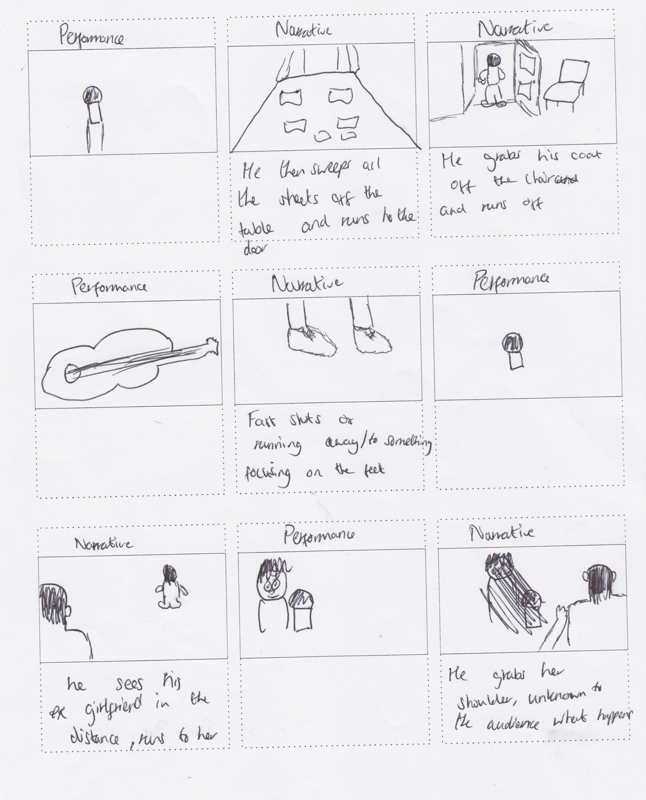
TW - Storyboard

This is our storyboard for our video, which is what we aim to replicate in terms of how shots are ordered. The narrative has since changed but this was the plan for the original idea. It will be composed into an animatic tomorrow.


TW - New Narrative Plan

As we have received critical feedback to our narrative aspect, I have now devised a new story-line that sees the plot enhanced. We now plan to use 4 small scenes, not 2 which means obviously there is now more of a story to tell.

The 1st sequence is the couple on a walk, enjoying each others company, there can be fade-type cutting used of them walking to being sat on a bench, showing time has elapsed yet still filming in exactly the same frame. The couple can also be feeding ducks as this is common around ilkley river, which is a location we are likely to use.

The second sequence will be the couple sat on the sofa, watching TV, in a sped up shot of them just sat there together in each other's company. The sped up shot allows us to show how much time has gone by with them just sat together. This shot will be cross cut with a transparent view of the couple arguing, and the camera circling them with fast paced shots. This shows that not everything is ok in the relationship and provides some narrative in the sense the audience has doubts about if the relationship will work out.

In the 3rd scenario we see them both moping around, unhappily and the possible use of drinking to connote depression, along with the gloomy setting. The male lead will try to call the girl in an attempt to sort things out after their fight, but she will read the caller ID and decide to not answer and simply let it ring.

All of the scenarios will begin with the original idea of the male lead looking at the particular scenario in a photo album, with the picture leading into the scene. The 4th scene begins like this, in which it gives us another happy time with the couple, possibly in a different colour scheme as the other scenarios to show that it was further back in the past, before the fight.
The shot will then fade back out into the view of him looking at the photo, and he will then put it in his pocket, and slam the photo album shut, possibly even dropping it to the floor with some of the photos dropping out. He then runs outside, and the narrative will end with the same shot we used in the rough cut, where the male runs up to the girl he was searching for, and it is narrative enigma whether they reconcile or not.

Some feedback to this idea was given by my media teacher, in which he suggested possibly including someone taking a photo of the couple, which could be used extremely well in the 4th scenario, as in a reverse of what happens previously, when the couple has had their photo taken, it reverts to him looking at that picture, which is a different spin on what we were going to do.
He also suggested maybe stamping on some of the images in the photo album, to highlight the male's anger to the situation.

Friday, 27 January 2012

GG- The Swing Movement (A brief history

The band formed in 2004 from the Yorkshire town 'Ilkley'. They are a four piece indie/alternative band with their own distinctive sound of powerful drum beats and strong bass lines. The four members: Ben Walker (Guitar and Vocals), Patrick Wanzala-Ryan (Guitar) , Joe Gamble (Bass) and Kieran Borrett (Drums).
In there short time of being together the band have managed to play at Leeds Festival, The Cockpit, The Love Apple and many more big venues and festivals, including preforming at a festival in Belgium. They have been signed to Long Island studios in London, who work with such bands as Wild Beasts. Here they created there first album 'Bottom of The Barrel' which they plan to re-record due to the creation of new songs. 'To The Bone' is one of their songs which has been released on itunes and had 100's of purchases in the first week. You can also find them on Spotify. There song 'Jigsaw', which we have selected to use, has been played on Radio1 with one guest saying "this is the best song we have received all week".

They are an up and coming young band who have suffered from the economical fall in the music industry. They are just waiting for the right recorded label to come along and hoping to kick start what should be a very successful career for them all.

Thursday, 26 January 2012

TW - Rough Cut Feedback And Analysis

After screening our first rough cut that uses BOTH performance and narrative footage, we received feedback that in short told us we needed to completely re-think the narrative shots, and try to change the performance footage.

We are however unable to tweak the performance footage, only change shots due to what footage we shot, but have not used.

Therefore, we are going to try and intertwine focus shots (focus out at the end of one shot, to the go back into focus and it is the next shot). This can be used when switching shots of the performer's, or even when changing from a performance shot to a narrative shot, if we shoot the narrative footage in accordance with focus levels.

Another problem is that there was too much movement and rotation in our performance footage, which needs to be both edited out and rectified, this can be changed by trimming some clips down, or even just replacing them. Also, the rough cut we showed had less narrative in than we planned so there was more performance footage that we intend to remove. Hopefully when we re-shoot the narrative footage, we will have more to put into the final cut and this will strengthen the video.

The narrative shots were not very well received as it was said that it was quite weak, with several major issues, so we plan a major overhaul in that area.

TW - Magazine Ad Analysis 1 - Artic Monkeys - Humbug Ad

I have chosen to analyze this advert as it is by The Artic Monkeys, which is one of the bands that George and I have taken influence from, with George even analyzing one of their digipak's for our research.

The band is very much alternative rock, with a hint of indie and other genres. It would be fair to say that rock is the wider aspect of their music, but when narrowed down it does fall into the alternative category. This particular advertisement has been featured across Europe for their album Humbug, and was created by DebutArt.

As you can see, the advert is quite bold and vivid in it's colour scene, although it does have a washed type feature to it which causes it to lose some of the vibrance and make the colours seem less eccentric.
The background is orange, and is fading from top to bottom. This is met by the colours of the words used on the ad, as 'Humbug', is most clear in colour, whilst '24 August 2009' is faded and is closer matched to the colour of the background, due to the fade effect.
The middle of the ad shows a band logo, possibly used exclusively for this album, and has the band name stenciled into the middle. The logo appears to be 2 faces, back to back, joined by what could be their hair, or a representation of collaborative minds in relation to creating the album.

The fact that the band name is used in a stencil effect, attracts attention to both the logo and the band name immediately, causing the reader to read the rest of the info, which is only small pieces of information, likely to remain in the audience's mind so they remember the advert and the info easily.

Whilst this magazine ad is fairly simple, it does the job and could be modeled or replicated if we chose to complete 2 magazine ads, this being used as influence on the more simple of the 2 ads we would create.

Tuesday, 24 January 2012

TW - The Swing Movement - A Brief History

The band, formed in 2004, began with around 20 members all jamming and having a good time. From the 20, 4 of the members, Ben Walker (guitar and vocals), Patrick Wanzala-Ryan(guitar), Joe Gamble (bass) and Kieran Borrett (drums) moved on and formed The Swing Movement.

They have progressed since then and performed at many local venues, with one song, To The Bone available to download on itunes, not to mention featuring on many renowned music applications such as spotify and last.fm.

They also have twitter, a fan page on facebook and an official myspace page to work with, and whilst they are still young, they have a lot of potential to be the newest big hit in the alternative/indie scene.

http://www.indiebandsblog.com/european-bands/uk-bands/the-swing-movement - This blog has some extra info on The Swing Movement including release dates amongst other pieces.

GG - Music Video has been a success!


Since I shot and edited our first sample scene for our performance footage it has been a big hit. Previous managers and record labels have seen the video and been in contact with the band. This shows the power of youtube, also after receiving over 250 views in a week. The video has also been used to enter the band into a competition to win a chance to support for Graham Coxon on his British tour this April. The video was placed onto his website and you can now vote to give 'The Swing Movement' a chance to perform in Gateshead. It can be seen and done on the following website:
http://toursupport.grahamcoxon.co.uk/share/entry/270

This video is only sample performance footage and we plan to add a love affair narrative to the performance. When all of this is shot we shall give the video to 'The Swing Movement' to help them keep on progressing in the music industry.

The video has been placed below:

Wednesday, 18 January 2012

TW - Digipak/Magazine Ad Jigsaw Idea

After thinking of ideas to incorporate into our digipak, George and I found that incorporating a jigsaw puzzle would be a good idea to use on one of digipak panels. This is because the song title is 'Jigsaw' thus gives us clear opportunity to utilise a marketing aspect, which would be using either jigsaw pieces, or some aspect of a puzzle in our ads and digipaks.

Image 1 - This is the template we found online
To get to the idea, we began with a blank template that we found online.

Once we had downloaded the template, we then proceeded to trace round it in order to layer the image. We did this in adobe flash.

Once we had traced the image, we saved it to look like it did in image 3.

After importing the traced version into photoshop, we then proceeded to layer each jigsaw piece, and then devised a DRAFT colour scheme. As seen, it was red/burgundy, black and white, which are basic colours, that are not too eccentric.


Image 2 - Tracing over the template 
Image 3 - Final trace

Using the red, black and white, we coloured in each jigsaw piece to show what he hope the final image might look like, before we edit it into a grainy effect to add an element of the jigsaw piece having been used previously, despite still fitting together.

As can be seen in Image 4, this is draft image, and not only does the editing need to be finalised, but we also need to add 'The Swing Movement' in, possibly a band picture, and also other aspects such as track listings, or an eye catching line, in order to maximise audience interest.
 
Finalised Image - Image 4

GG - Digipak idea 1

Tuesday, 10 January 2012

TW - Plans For Digipak Based On Deconstructions

An Example Of Andy Warhol's work

  • The Linkin Park digipak for Minutes To Midnight has shots that would be perfect to replicate on our digipak, and these type of pictures are seen commonly on other successful digipaks and CDs as well.
  • Rammstein's use of the same close up shot of each band member in white could be well received, although an Andy Warhol type shot could also work in this instance.
  • Using that style also means we could use a shot of all the band and add this effect, not just one band member for each panel.
  • Going back to the Linkin Park digipak, the use of black and white appeals to us greatly.
  • We are likely to avoid the artwork used on the Reanimation digipak as it would be extremely hard to replicate work anywhere near this level of quality.
  • The cropping and trimming of shots used on the Green Day digipak also appeals to us, and we may opt for this technique for one panel, or replicate the inner panel of Linkin Park's Minutes To Midnight digipak which has lots of images almost collaged together from behind the scenes and locations.
  • The Reanimation usage of different colours for the words (both band and album title), and then add a small background around them, and reversing the colours, is appealing.
  • MUSE's use of a border in between 4 similar images on the inner panel of The Resistance, and then tweaking the effects such as lighting in each one, is also good, and we could fuse this with an Andy Warhol type piece of work of behind the scenes shots, which could work.
  • One problem with the Andy Warhol work is that the colour scheme is slightly eccentric therefore we may have to use simple colours such as black white and red, to make it effective, as none of the digipaks I have studied use colours such as pink and bright green.

TW - Common Conventions Seen In Digipak Deconstructions

After deconstructing 6 digipaks in the rock genre, I have now seen some trends and similarities form after observing each panel of each digipak. They are as follows;

  • Title and band name are situated, usually at the top, of the front cover, in a colour that oppositions the background, in order to bring attention to this.
  • Either a picture of the band, or artwork is used on the front cover. Artwork is usually used in the foreground of eccentric background, with effects such as splattering other colours into it.
  • The back cover includes song titles and logos such as the DVD one, and parental advisory notifications, that can also be seen on the front sometimes.
  • The back also maintains the same backdrop as the front cover, and can include images, or remain plain, only including track lists.
  • The artwork is continued in the inner panels, and the images are similar across them, not much changes as sometimes the band opt to use a shot, and use it across all 3 panels in the middle.
  • The inner panel can either have song listings and the band logo, or maintain the artwork displayed on the front and back.
  • All digipaks meet a theme, whether it be animation, or a background colour, or even a continuous use of a similar shot, and this works well, this one in particular we will try to adhere to

TW - Digipak Analysis 6 - Rammstein - Made In Germany - Genre Rock

Although Rammstein fall into the Rock genre, and are considerably a heavier band that The Swing Movement, their digipak for this particular album can be used as it could be applied to any genre, it is simple yet effective, and differs from many takes in which shots of the whole band are used as a shot for simply one panel.

Front
Title is at the top of the cover, in gold.
White background, with a band member painted fully white from head to neck, there are no parts of him that are not colored, he is in close up.

Back
The back uses the same clear white background, the back of the band member's head can be seen. Song title are situated where his hear should be, on the back of his head.
A gold barcode and credits are at the base of the neck.
Ears are red, possibly where the band member has had piercings previously.

Inner Panel
White background.
Other band member in close up, same shot as before with the member being pained fully white.

Middle Panel
Total of 6 panels, which is double the amount of panels in a usual digipak, suggesting this could be a special edition.
All the panels are the same, either having a band member in close up shot from the front or the back.
All of their necks have crosses on them, as well as stars and dates, possibly birth dates.
The use of white on a white background is effective and offers a different take on the usually heavy coloured backgrounds seen in other digipaks.

TW - Digipak Analysis 5 - Green Day - Bullet In A Bible

Green Day are another band that fall into the rock category and although The Swing Movement are an alternative/ indie rock band, this Green Day digipak has elements that could easily be common or replicated in a digipak for the alternative/indie genre.

Front
Parental advisory at the bottom right of the cover, DVD logo bottom left.
Red Background, with the Green Day band logo shaded into it.
Band member is stood in the middle, posing in a typical rock star-esque manner.
This image is black and white, and fans can be seen at the bottom of the cover, evidently as the audience to this band member posing.
These two aspects indicate that an image has been take and both trimmed and cropped, as this is in black and white, whilst the background is a rich red colour.
Band name and album title, are above him, in clear white.
The album title is in the top right, almost as the band member in view is pointing to it, this is a nice touch in my opinion, and could be a small albeit significant audience attraction the front cover.

Back
Track list is in the top left corner, song titles are in white.
The background is the same red colour seen on the front cover.
There is a small trim across the back in diagonal, in which colour picture of each band member are situated across, performing live.
The bottom right has a red background, with fans cheering seen, again in black and white, white writing is used for credits/production company names.
Barcode is seen, and FBI logo against pirate copies, both in colour in contrast to the background.

Inner Panel
White, with balck writing, credits can be seen at the top.
On this slide is simply text, no images, just credits for everyone involved in each composition, ordered by track list number.

Middle Panel
Red background.
The left panel has black and red image of a band member, with instrument in hand, in a mid shot.
Middle panel is relatively similar with the same background and colour choices, however it is the drummer seen, in mid shot, whilst playing.
The right panel is a close up of the band member seen on the front, however only his guitar is in focus in this shot, and the colour scheme is the same as the previous two panels.