For this task, we decided to find firstly the conventions seen in music video as a whole, and then the conventions we see commonly in our chosen genre, which is Alternative rock.
Music Video Conventions:
- Fast Paced Editing
- 3 Types Of Music Video - Narrative, Performance or Concept (A lot of today's music videos are hybrids of the 3 different styles, often including both performance and narrative)
- Lip Syncing
- Match On Action
- Distinct Setting
Conventions seen in our genre:
- Fast paced editing and match on action
- Distinct and vivid setting
- Hybrid of the 3 types of music video, rarely just narrative or performance
- Focus on the lead singer is common to the Rock genre as a whole, not to mention sub-genres
Magazine Advertisement Conventions:
- Tour Dates
- Reviews - of the band or the album advertised usually
- Band Information - such as twitter and facebook links, QR codes to band web pages
- Music Label details and Copyright symbols
- Possibly an image of the band, if the artwork is not already of them
- Image of the CD cover, with 'Out Now' next to it, to further promote the album
Conventions seen in our genre:
- Tour dates and reviews are especially common
- Label details and Band info
- Artwork, it is usually concept art and not of the band
Digipak Conventions:
- Paperboard design style
- Band or concept art as a theme, and not a mixture of both
- Booklet and booklet sleeve
- Web info - which we found increasingly common in today's CD albums and digipak products.
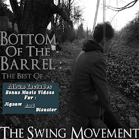
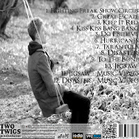
- Track List, Album Name and Band Name
Conventions seen in our genre:
- Band or images, artwork is rare
- Track List, Album Name and Band Name
- Web Info
- Booklet and Booklet Sleeve
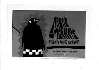
One band we focused our attention on was the band Arctic Monkeys. Many of their music videos are concept videos, like ours, and their advertisements and CD covers do replicate some of our final work.
Whilst both myself and George's job was to analyse work from our chosen genre and sub genre, which is rock, furthered by alternative rock, we did pay particular attention to this band due to their success and high following, George especially.
Whilst both myself and George's job was to analyse work from our chosen genre and sub genre, which is rock, furthered by alternative rock, we did pay particular attention to this band due to their success and high following, George especially.
For the music video, as seen in 'Teddy Picker', we emulated a lot of the performance shots used by using shaky, natural camera work, which is seen in many alternative band's videos, let alone a band we had particular focus on. The narrative aspect of our music video was based around many videos in today's music, in which there is usually focus on a romance, to which we adapted to it being a lost romance, between people in our age range in order to relate to our target audience.
As you can see the shots we took in this all performance cut of our video do emulate the ones in 'Teddy Picker':
For our magazine ad we again looked at adverts from our genre, and some from other genres of music video. For example, the inspiration found for our font style was seen in an advertisement for Kyle Park, who is a country singer, which is a totally different genre to indie/alternative rock. Both this advertisement and the advertisement for Arctic Monkeys: Favourite Worst Nightmare gave us inspiration as both of these ads had artwork on the left, and the key text on the right, which can be seen in our work. This layout is prominent as the image that draws the attention is first seen, on the left, before a closer look at the ad can give the audience the finer details about the band and the product being sold.


 |
| As you can see we have emulated work both from our chosen genre and ad conventions on a whole |


Although our idea is different to that used on this album, you can see that using the same shot with different editing can be very effective.

No comments:
Post a Comment
All Comments Moderated