Welcome to my blog which has all the info about my A2 media production, which is producing a music video accompanied by production of a digipak and a magazine advert.
Friday, 4 May 2012
Final Digipak
As you can see on the digipak, we used several indie record labels to give the impression that this was a signed band. We uses Sell-a-Lot Records for the actual record label, ioda for the production company label and yeproc records for the distribution company label.
Thursday, 3 May 2012
Evaluation Question 1
In What Ways Does Your Media Product Use, Develop Or Challenge Forms And Conventions Of Real Media Products?
For this task, we decided to find firstly the conventions seen in music video as a whole, and then the conventions we see commonly in our chosen genre, which is Alternative rock.
Music Video Conventions:
For our magazine ad we again looked at adverts from our genre, and some from other genres of music video. For example, the inspiration found for our font style was seen in an advertisement for Kyle Park, who is a country singer, which is a totally different genre to indie/alternative rock. Both this advertisement and the advertisement for Arctic Monkeys: Favourite Worst Nightmare gave us inspiration as both of these ads had artwork on the left, and the key text on the right, which can be seen in our work. This layout is prominent as the image that draws the attention is first seen, on the left, before a closer look at the ad can give the audience the finer details about the band and the product being sold.
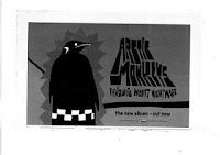

For our digipak, we again took inspiration from Arctic Monkeys, this time focusing on their use of black and white colour scheme, whilst using basic images with small amounts of editing. This enhances the overall product as the chosen image is a strong one, and then the editing performed adds value to the product.
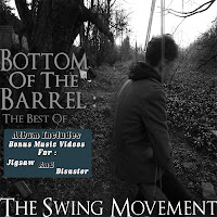
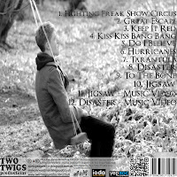
Although our idea is different to that used on this album, you can see that using the same shot with different editing can be very effective.
For this task, we decided to find firstly the conventions seen in music video as a whole, and then the conventions we see commonly in our chosen genre, which is Alternative rock.
Music Video Conventions:
- Fast Paced Editing
- 3 Types Of Music Video - Narrative, Performance or Concept (A lot of today's music videos are hybrids of the 3 different styles, often including both performance and narrative)
- Lip Syncing
- Match On Action
- Distinct Setting
Conventions seen in our genre:
- Fast paced editing and match on action
- Distinct and vivid setting
- Hybrid of the 3 types of music video, rarely just narrative or performance
- Focus on the lead singer is common to the Rock genre as a whole, not to mention sub-genres
Magazine Advertisement Conventions:
- Tour Dates
- Reviews - of the band or the album advertised usually
- Band Information - such as twitter and facebook links, QR codes to band web pages
- Music Label details and Copyright symbols
- Possibly an image of the band, if the artwork is not already of them
- Image of the CD cover, with 'Out Now' next to it, to further promote the album
Conventions seen in our genre:
- Tour dates and reviews are especially common
- Label details and Band info
- Artwork, it is usually concept art and not of the band
Digipak Conventions:
- Paperboard design style
- Band or concept art as a theme, and not a mixture of both
- Booklet and booklet sleeve
- Web info - which we found increasingly common in today's CD albums and digipak products.
- Track List, Album Name and Band Name
Conventions seen in our genre:
- Band or images, artwork is rare
- Track List, Album Name and Band Name
- Web Info
- Booklet and Booklet Sleeve
One band we focused our attention on was the band Arctic Monkeys. Many of their music videos are concept videos, like ours, and their advertisements and CD covers do replicate some of our final work.
Whilst both myself and George's job was to analyse work from our chosen genre and sub genre, which is rock, furthered by alternative rock, we did pay particular attention to this band due to their success and high following, George especially.
Whilst both myself and George's job was to analyse work from our chosen genre and sub genre, which is rock, furthered by alternative rock, we did pay particular attention to this band due to their success and high following, George especially.
For the music video, as seen in 'Teddy Picker', we emulated a lot of the performance shots used by using shaky, natural camera work, which is seen in many alternative band's videos, let alone a band we had particular focus on. The narrative aspect of our music video was based around many videos in today's music, in which there is usually focus on a romance, to which we adapted to it being a lost romance, between people in our age range in order to relate to our target audience.
As you can see the shots we took in this all performance cut of our video do emulate the ones in 'Teddy Picker':
For our magazine ad we again looked at adverts from our genre, and some from other genres of music video. For example, the inspiration found for our font style was seen in an advertisement for Kyle Park, who is a country singer, which is a totally different genre to indie/alternative rock. Both this advertisement and the advertisement for Arctic Monkeys: Favourite Worst Nightmare gave us inspiration as both of these ads had artwork on the left, and the key text on the right, which can be seen in our work. This layout is prominent as the image that draws the attention is first seen, on the left, before a closer look at the ad can give the audience the finer details about the band and the product being sold.


 |
| As you can see we have emulated work both from our chosen genre and ad conventions on a whole |


Although our idea is different to that used on this album, you can see that using the same shot with different editing can be very effective.
Evaluation Question 2
How Effective Is The Combination Of Your Main Products And Ancillary Texts?
What ancillary texts we used:
What ancillary texts we used:
- QR code - scanner for smartphones which links to a performance cut of the music video
- Viral Advertisement, with the QR code on - provides audience intrigue and interest
- Magazine AD
- Digipak
- Music Vid - main product
- Blog
- Twitter Account
We believe the QR code and viral advertisements were effective as they added a lot of enigma and intrigue to our products, with the barcode scan being a focal point for us. This is an example of social media integration as it interacts the audience, and the fact that the viral advertisement, as seen in my evaluation video, is lacking any real text or info on, the barcode should provide our audience with reason to scan and find out more.
The digipak was a key ancillary text for us as not only was it a sub project for the whole task, but it was essentially what the magazine ad was promoting, so it was very important. The cover can be seen on the magazine ad, as well as the cover linking to the ad itself therefore giving the audience a greater opportunity to recognise and relate all the products together. The microphone shot we have used for inside panels is very similar to shots seen in the video, aside from the editing to the image for the panels, and this is again a recognisable thing for the audience to see, not to mention the band being edited into this. One other aspect of recognisability is the track listings, in which the audience can see not only the bonus music video content but other songs, and they may recognise these pieces, encouraging to purchase the product.
 |
| Back Cover |
 |
| Front Cover |
 |
| Spine |
For our magazine ad, we used a very similar shot to the digipak, thus relating the products so the audience can remember these as a set of products promoting the same thing. There is a QR code seen on both products which again connects us into today's social media.
The blog both samples and promotes our work, whilst also updating our audience on news about our products. They can find inspirations for our work, feedback for our work and answer polls. This helps us interact with the audience, and we can also give excessive info on all our products and ancillary texts used. The twitter feed is another way to interact with the audience and promote our products and ancillary texts.
The music video itself is heavily connected to the ancillary texts, to begin with we have based the idea for both the digipak and the magazine ad around the band's name, highlighting the 'Swing' part of 'The Swing Movement'. We played on this and initially intended to have myself on the swing due to my role in the music video, which would have made a lot more sense to the audience. However, due to other commitments we were running out of time and George had to step in and take the place, although we tried to make the images, for the magazine ad at least, give the impression that it could be a member of the band or be a generic character that can be related to, with him sat on a swing conveying he is thinking and is at the 'Bottom Of The Barrel'
Evaluation Question 3
What Have You Learned From Your Audience Feedback?
What audience feedback we recieved:
In our case, the music and the performance was an attracive selling point for the males, whilst the romantic narrative was a key drawing point for the females. One clothing change we made in relation to this was to make the girl wear a red jacket in the happy scenes, to signify love and romance, thus attracting an appeal from an audience that enjoy aspects of the romantic genre.
For our rough cuts the feedback we recieved was mostly positive and only minor changes were decided to be needed. Clothing changes such as shoes and coats were changed, especially on the male character, whilst other feedback on performance footage being shot on the side also taken into consideration. It helped that the most of our feedback was given by fellow 6th form students, making the feedback even more important as it was from both our primary and secondary audiences, so the product is relatable. Several youtube users also gave their opinions which helped us gain feedback from a wider community.
George also had the initiative to enter the video in a music video competition, to which the video won, allowing us to see that our work had been a success. This allowed us to gain feedback from people in the industry, and the fact that they chose it as a winner shows our work has been recognised and praised by these people. These people are also likely to be members of our wider audience and not in our primary and secondary audiences, so again it was useful to see that the product has been a success in these more diverse parts of our audience.
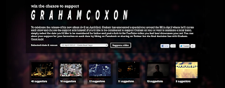
We made a twitter account for our production company, which was a success and we gained a few followers. This gave production updates and people could tweet to the account to see any progress updates or other important news, they could also send feedback here, showcasing the use of social media integration.

The QR code also played a major part in our feedback as it directed people to the performance footage, so people could leave us feedback on the youtube page.
What audience feedback we recieved:
- 3 full rough cut screenings with feedback afterward
- Full performance cut of our video
- Submission into music competition
- Twitter followers
- QR code views
- Blog hits and polls
In our case, the music and the performance was an attracive selling point for the males, whilst the romantic narrative was a key drawing point for the females. One clothing change we made in relation to this was to make the girl wear a red jacket in the happy scenes, to signify love and romance, thus attracting an appeal from an audience that enjoy aspects of the romantic genre.
For our rough cuts the feedback we recieved was mostly positive and only minor changes were decided to be needed. Clothing changes such as shoes and coats were changed, especially on the male character, whilst other feedback on performance footage being shot on the side also taken into consideration. It helped that the most of our feedback was given by fellow 6th form students, making the feedback even more important as it was from both our primary and secondary audiences, so the product is relatable. Several youtube users also gave their opinions which helped us gain feedback from a wider community.
George also had the initiative to enter the video in a music video competition, to which the video won, allowing us to see that our work had been a success. This allowed us to gain feedback from people in the industry, and the fact that they chose it as a winner shows our work has been recognised and praised by these people. These people are also likely to be members of our wider audience and not in our primary and secondary audiences, so again it was useful to see that the product has been a success in these more diverse parts of our audience.

We made a twitter account for our production company, which was a success and we gained a few followers. This gave production updates and people could tweet to the account to see any progress updates or other important news, they could also send feedback here, showcasing the use of social media integration.

The QR code also played a major part in our feedback as it directed people to the performance footage, so people could leave us feedback on the youtube page.
Evaluation Question 4
How did you use new media technologies in the construction and research, planning and evaluation stages?
What aspects of new media we used:
- Digipaks
- Viral advertisements
- Magazine advertisements
- Music video competition
- Online Feedback
- Blogs
- Nikon D-300S
- Photoshop Elements
- Final Cut Express
- iMovie
SCREENSHOT OF CAMERA
Photoshop was also an important technology we used in the construction process of our products, namely in both our ancillary texts. Although my skills on photopshop were fairly limited, it was still a key technology in both drafting and then completeing our final digipak and magine advertisements. The application made the editing of these products a lot easier, and improved the quality also.
In making the digipak and mag ad, tusing the auto correct and auto sharpen tools were how I began the processes, as it immediately rendered the photo into looking completely different and unique, before I converted it into black and white, going with teh newspaper effect for the magazine ad, and the infared effect for the digipak. I then proceeded to crop the phot and then used the magnetic lassoo tool to select key parts of the photo, in order to layer them and give the swing impression that can be seen on both the covers of the digipak.
We differed in style as the layers on the magazine ad had colour on in order to attract the audience's eye, but we kept the product basic, which is an indie convention, and remained in black and white on the digipak.
For the spine of the digipak, I used the clone stamp tool to get some of the indie background seen in the front cover, and then used this as it looked very effective, whilst also being a connecter between the front and back covers, as the background was the same on both sides, albeit on the back cover it being extremely lighter, to contrast the front.
Finally, the opacity had to be reduced on some layers., and then they had to be both locked and linked together, in order to merge together so the product could be once again cropped before it was finally ready.
iMovie was particularly useful for our rough cuts, as we could draft them out on this application, and prepare the video before the important editing such as cross cutting could be done on Final Cut. Without iMovie we would have gone into the key construction stage of the music video with a vague picture of how we wanted our shots to be organised, so it was key to our planning stages
Our blogs were key to our research and planning stages as it was on here that we could convey our ideas, inspirations and industry convention analysis'. They also helped us integrate facebook, twitter, and youtube into our final product which was a benefit when evidencing.
Final Cut - On final cut we had to order clips, cut them and add layers or transitions to them. George managed to find many key transitions, such as an out of focus shot that would go into the next one, which became key in our music video when we incorporated the idea of using flashbacks. Cross cutting can be seen towards the end of our video and this again was a key part of the editing process. It was also essential to use final cut in order to extract audio from the narrative and performance clips, and layer the music track onto it so that is all that could be heard.
The music video competition George submitted the video to was useful in the research and planning stages as we got genuine feedback from people in the industry and therefore this feedback was taken with extreme consideration as if they enjoyed the product, then we knew we were doing a good job. It also allowed to have added screenings and gave the video more views than it would have done had it not been submitted.

Subscribe to:
Comments (Atom)


